Knowledge is a double edge sword. Your life will become better or worse as you gain more knowledge, and start paying more attention to details. For example, before you talk to your neighbor and know they wake up at 5am in the morning, you might not even notice you have a neighbor. But after you get to know them, you might start to wake up at exactly at 5am every morning and start noticing the shower, the morning coffee machine, the door slam, the car engine, etc... And you count them one by one before finally it becomes quiet and you could go back to sleep again. So, I will leave it to you to decide whether you want to get to know your neighbor or NOT :)
Same logic applies to knowledge gained from your occupation. The product design knowledge I gained has gifted me a magnifier in my daily life to evaluate almost everything I encounter. This leads to great pleasure when I see some excellent design from time to time, though unfortunately more often it leads to discomfort and a desire to shout out, which directly leads to this post.
I was visiting a local public service office whose phone was never picked up, so there was a long waiting line for walked in. When the office is closed, people started to walk out, and I notice the guy before me was really confused by the door. The door has a pushed-down handle as below, so he push the handle but the door did not move. He tried harder but the door stood still. He turned around looking confused. And it turned out the the similar looking door adjacent to it was for exit, while this door was for entrance. Why does a door have a push-down handle when you could not push it? Poor design. Haha, sound familiar, right? Search for '
Norman door' on Google. And afterwards, you will start noticing doors like this everywhere.
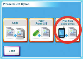
Then I went to Fedex to print out something from my email attachment. Glad to find they have some fancy self-service machine, called print and go. The machine looks like this:
And I figured out that I should choose 'Print from mobile device' from their instruction printout.
But how could I print from my mobile device? They ask me to send an email to printandgo@fedex.com, but what happened after I send it out? Do I need to call the stuff there to print it out for me, or is there a printing queue within this machine that contains my file?
Then I look at the screen which list the following section. Which one should I choose? The only one with a mobile image is 'Print with retrieval code', but where can I get a retrieval code? Oh, I was thinking and thinking and confused!!
So I asked the stuff for help, and she totally understood my confusion. I bet she must be bothered multiple times each day to ask how to use it. Turned out it's very simple, once you sent out an email to printandgo@fedex.com, you will receive the retrieval code, which you could enter to print out your material. So simple! One sentence! Why didn't Fedex put the ONE sentence in the instruction to help reduce the confusion and save time for both consumer and Fedex stuff??
Another confusion comes out when I start to print. My document has 2 pages, and I was very happy with the preview function given by the machine. Looks perfect. So I keep on pushing 'continue', and wait for the print out. But, but, it comes out with only one side! And, it's on a very thick and smooth card board material, not a regular printing paper. What happened??? I called the poor stuff again, she again totally understand and told me this machine is 'difficult'. She finally put the paper in again to print out the other page for me on the other side of the card board. And at this moment, we probably have already spent more than 20 minutes to print this out.
It's a bit unfair to say the machine is difficult to use. It's actually very simple: just send an email, slide your credit card, enter the retrieval code, set up two side printing if needed, and you are done. Should be smooth. Product or engineering wise, it's good. The problem is in the last mile, where they did not give sufficient instruction on this novel machine, and new users are stuck. Perfect product design needs to take the actual users seriously, and observe how your users interact with the products. If Fedex have actually ask real users outside of their product team for testing, they should have already figured out this usage gap easily and improve the product? If they haven't, they should already hear complaints from stuff working in the store about the lack of clear instructions, and have fixed it already? Well any way, I am hoping to see some fixes soon.
Well, I have been mainly talking about the downside of knowledge gaining today. This is just to illustrate that knowledge could sometimes be a double edge sword. At the end, I still want to know my neighbors better, and gain more product design knowledge :)


 tments. Choose some keywords such as "Mountain View" to narrow down your choice. Another useful website is